Google Analytics 101: Understanding the Data on the Home Page
What you’ll learn about the Google Analytics home page:
- Google Analytics doesn’t have to be scary
- The Google Analytics home page has a number of useful graphs and data
- This includes audience overviews, real-time overviews, active user insights, and more
Google Analytics. Those two words can seem daunting to anyone new to SEO, marketing, and web site traffic — but they don’t have to.
What can initially look like too many terms, too many graphs, and too many functions, is laden with useful information. While we’ve covered Google Analytics a lot (we even have a complete guide to mastering it) this post will define the most important terms and visual graphics that you need to know.
A Look at the Google Analytics Home Page
The home page provides a high-level overview of the most important statistics and data from each report, visually illustrated with graphs and charts. This is where you should focus your immediate attention when you’re first digging into the Google Analytics platform. Each high-level overview links to a more robust and detailed report that can be filtered and uniquely searched to suit your needs.
Audience Overview
Users
A user is an individual’s unique browser cookie on your website. Each user can visit your site multiple times, with each site visit recording multiple page views. Because each device you find websites on (smart phones, laptops, tablets) each has a unique browser cookie, a single user using multiple devices will be counted as a separate user.
User ID
The User ID feature allows you to track individuals who identify themselves across multiple devices.
Sessions
A session consists of a single visit to your website from one user. One visit might include several page views, any event e-commerce transaction, or click through. Sessions timeout at 30 minutes, which means that if someone is inactive on your website for over 30 minutes, then a new session will be reported if they perform another interaction.
Bounce Rate
Bounce rate is the percentage of sessions with a single page view. Bounce rate provides a glimpse into how your content is performing and where it can be optimized. Lower bounce rates mean more users visiting multiple pages on your site. It’s imperative to understand the context and objective of your content and pages, not every user will need to view multiple pages (e.g. someone simply seeking your contact number).
Session Duration
Simple as it sounds, this records the duration of each unique user session on your site.

Real-Time Overview
Active Users
As the real-time overview report name suggests, active users are those that are on your site currently. This data is updated within a few seconds and is viewable for the previous 30 minutes.
Active Pages
The Active Pages report shows you the pages people are currently viewing on your website. When the user navigates to another page or closes the window, the active page is removed from the report.
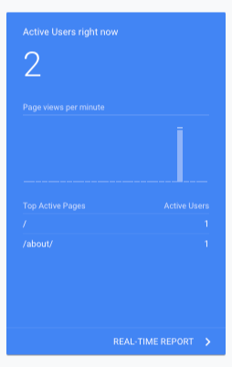
Google Analytics, Active Users
Acquisition Overview
Traffic Channel
Traffic channels provide high-level groupings of your inbound marketing. The default channel grouping includes ‘Organic Search’, ‘Paid Search’, ‘Social’, and ‘Email’.
Source/Medium
Typically used in conjunction with traffic channels, source/medium informs you of which platform they used to find your content i.e. Google, Bing, etc.
Referrals
A referral is when a user finds your website or content link from another third-party website. This report allows you to see all the sites (and even pages within that site) that are sending you traffic. Because these referrals can come from a voice of authority in your market, we always preach the importance of link building to both our clients and our readers.
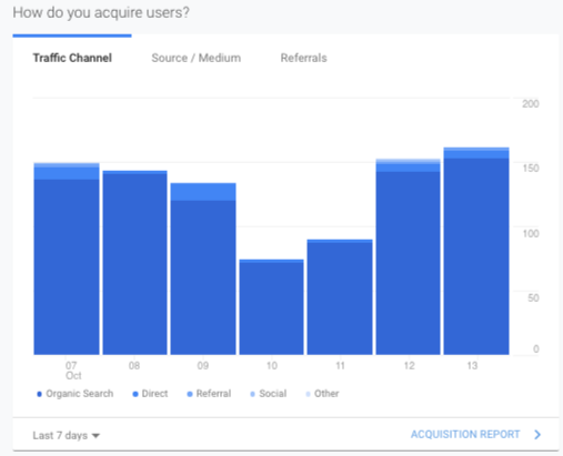
Acquisition Reports Overview In Google Analytics Home Page
Location & Time Overview
While this overview image doesn’t include any litany of terms you’re not aware of, it is important to understand geographically where your audience is finding your information For instance, if most of your audience is finding and exploring your web page from Portugal, but your services are only available in the state of California, it might signal to you that your site or ad spend needs some optimizing for your specific region and market.
User Sessions by Time of Day
Again, this graph doesn’t include any terms that need to be defined, but it does visually illustrate the time that most visitors seem to be finding, and browsing the content of your website. This information can be very useful to inform your upload schedule.
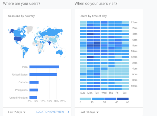
Locations and Time Reports in Google Analytics Home Page
Active Users Overview
This overview graph simply shows you how your active users are trending over time. Trending up? More active users are visiting your site, suggesting you’re attracting more readers. Trending down? Just the opposite, and time to look at your content, content schedule, and objectives.
Pages Overview
Pages
The specific page title within your website that are most clicked on in a given time period.
Pageviews
The number of times each page is visited in a given time period.
Page Value
If your pages have e-commerce transactions and value-based goals set, this data can provide the impact of those page’s performance and conversions.
Goals Overview
Goals
The goals report tracks actions on your website as informed by your individual objectives. Some examples include visiting a specific page, subscribing to a newsletter, downloading a resource, or making a purchase. These goals can be set inside Google Analytics and can be customized to fit several specific parameters.
Conversion Rate
A conversion is reported whenever a user completes a goal or makes a purchase during a session.
Completions
When a user converts for a particular goal during a session they’ll be counted as a goal completion. If a goal is completed multiple times during a user’s session, it will only be counted as a single conversion.
Goal Value
Dollar values can be set for each goal inside Google Analytics. The goal value can be used to report on an actual dollar value, a calculated value or a symbolic value for each conversion.
Mobile Overview
This simple graph can be very informative to your website’s performance. Breaking down your site visitors by the devices they come from, be it mobile (smartphones), desktop (PC’s, laptops), or tablets. If the majority of your audience is tapping into your content from mobile devices, you should focus your efforts on how your content and page layouts look and optimize on mobile phones. If you’re looking for information on how to best optimize your page for mobile, we covered the topic extensively.
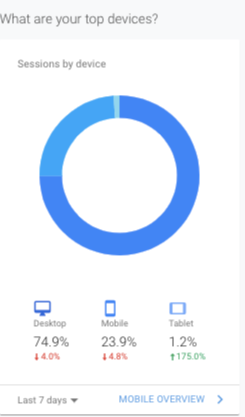
Mobile Overview In Google Analytics
Cohort Analysis Overview
A newer feature of Google Analytics, cohort analysis shows you users segmented by date. You can use this report to see when a user submits an email for a newsletter sign up, and when they return to your website thereafter.
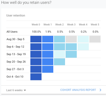
Cohort Analysis, Google Analytics
As far as Google Analytics goes, the home page gives you plenty of data from which to inform your SEO strategies, but it is just the tip of the iceberg when it comes to the power and insights you have access to from the platform. We’re constantly diving deeper into analytics and providing you with new ways to harness the true power of the platform, like our recent post covering how to audit your websites exit points.
For part two of our Google Analytics 101 series, click here.
Photo by Myriam Jessier on Unsplash

