Create Your Own Infographics with These Free and Low-Cost Tools
[Originally posted June 2014; updated July 15, 2019]
Infographics are a visual representation of information that, once seen, can really stand out as a part of your overall digital marketing strategy.
Statistics and information jump off the page in colourful, bold, fun graphics, grabbing your readers’ attention and translating that information into useful data that can be easily digested. To put it simply: infographics are a really awesome way to make otherwise boring numbers and text interesting and memorable.
But you’ve probably heard of all this before, right? The problem isn’t that you hate infographics. The problem is that you don’t know how to create them. After all, chances are that you’re not a graphic designer by trade. The good news is that, with the right tools and a bit of planning, you’ll soon be creating your own infographics!
Why Create Infographics?
Take a look at this full-page infographic posted by Neonam – studies show that people remember 80% of what they see, versus only 20% of what they read … and only 10% of what they hear.
Think about any presentation you’ve ever seen. Data of any kind is always enhanced with charts and diagrams and images, since visuals are more engaging, more persuasive, and easier to remember. Educating your audience with killer content such as infographics is not only important for conversions, but for sharing as well, which means more recognition and more traffic to your blog or site.
Where and How To Get Started
Okay, so now you know why you’d want to create an infographic. But how do you get started?
The type of information to include in an infographic is really up to you – the world is your oyster. As long as you have information or data to be illustrated, you can do it with an infographic. For example, you could create a visual article where you take large bodies of text, break it up into “interesting facts” and use cartoons and word bubbles to display it. Or, you could create a numerical article, where you take your spreadsheet data and transform them into charts and diagrams, making them more visually appealing and easier to understand.
Other options include timelines in which you portray dates and events along a road or chart, or “vs” infographics that compare two bodies of information (ie: calories in one type of meal plan vs. calories in another). Another popular type that you’d recognize is the flow chart, where you follow the flow of data to find a certain output answer.
Unbounce has created the Ultimate Guide to Marketing with Infographics, which is a fantastic reference that will help you decide what kind of content to include, how to research and find the data you need, and how to design the layout of your infographic to achieve maximum audience engagement.
Another great resource is visiting The Daily Infographic. They feature a different top infographic every day, which is great for design and data inspiration.
The Infographics Tools You Need
I’m a strong supporter of infographics (you can see one in a previous post) and how powerful and useful they can be. However, many small businesses or companies without dedicated graphic design resources find the process of creating infographics overwhelming.
Are you a non-designer who is totally overwhelmed by Photoshop? Have no fear: I’ve done the legwork for you, and have come up with a list of some awesome online tools that will allow you to create your infographic from scratch – all while looking professionally designed.
Infogram
This free (yes, free for basic access!) tool is super easy to use. If you have your data on a spreadsheet, you simply upload it to your account, and use that to create a data visualization through a wide range of chart options (over 37+ types – column, pie, scatter, treemap, financial – they have something for everyone). You can also add your data from scratch, as they have a built-in spreadsheet function that makes it incredibly easy to type in your data, and then watch it get built into the chart type you have selected.
They also offer great design templates which are basic, but decent, and you can add pictures, text, videos or maps to enhance your charts or other data. When your design is finished, you can share or embed it with a click of a button.
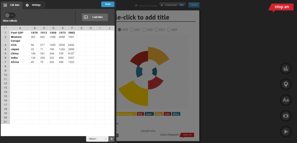
They do have a number of paid-upgrade options ranging from : $19-$149/USD per month for Pro, Business or Team access. These different paid tiers give you access to 100+ design templates, the ability to add your own logo, interactive charts, live data or download your finished product as a PDF or PNG file, which can also be password-protected.
Infogram is a great option for a new infographic ‘designers’. It’s a very user-friendly, intuitive tool that will get you started with a relatively short investment of time.
Canva
We really like what Canva has to offer. Not just for infographics, Canva can also be used for a variety of other design projects, like spicing up your Facebook or Twitter cover/header, or creating a photo collage for a Pinterest board. They offer a huge selection of Design Tutorials, which provide templates and tips for anything from “Going Retro” to “How to Pick Colours that Look Great Together”.
A recent addition, they also provide a section of “Editor’s Picks” of some really great templates, that you can choose to “remix” for your own purposes. You can pick from a number of layouts, backgrounds and colour schemes to create and visualize almost anything your heart desires.
A Basic account gives you access to 8,000+ templates created by professionals. Even if you are the most design-challenged person, you will still be able to pull off beautiful and classy graphics and make everything think you are the pro.
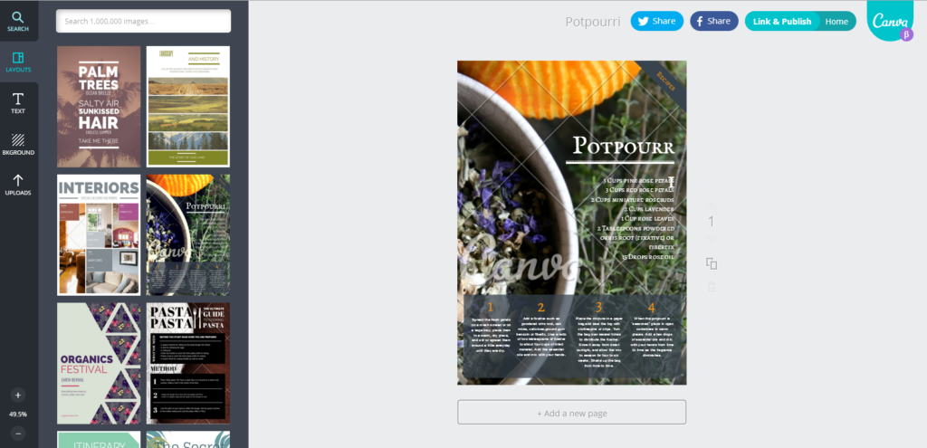
Another free tool (for basic access, Pro access is $12.95 USD/month), Canva is a perfect, step-by-step way to generate professional-looking designs without needing a degree. It’s also a great way to create flyers for that garage sale you’ve been meaning to have …
Piktochart
Piktochart is a good mix of what would happen if Infogram and Canva teamed up. They offer the same spreadsheet and chart functionality of Infogram, with the customization and template options of Canva. They have a User Showcase which displays a collection of users’ infographics, which are a great way to get some inspiration and design ideas.
Good news and bad news: Piktochart does offer a free version, but it’s limited to how many visuals you can create. However, the Pro Package can be purchased for only $29USD/month for individual access or $99 USD/month for team access, and this gives you unlimited visuals, access to 1000s of free icons and images, high resolution PDF exports, SEO-friendly output, and custom colour schemes, fonts and logos.
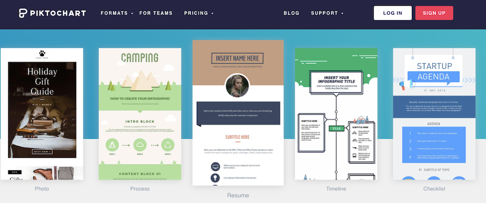
If you have the budget, Piktochart is a good investment, mostly due to the flexibility it offers in terms of multiple export formats and sizes, as well as access to beautifully pre-designed themes and images to create unlimited visuals. If infographics will be a regular thing in your marketing plan, then we recommend the spend.
Visme
Visme is everything you need to tell powerful visual stories not only through infographics but other presentations, charts or graphics. Their intuitive tool allows you to build your own custom infographic in three easy steps. You can choose to use their professionally designed templates, or create your own with easy drag-and-drop content blocks from their library. One of Visme’s best features allows you the ability to adjust text, colours and backgrounds of any template you use.
Next, you can display your data through one of twenty available charts by importing data from an excel spreadsheet or a connection to live data. You can visualize your statistics through drag-and-drop data widgets, which are fully customizable to your preferred colours. Finish off your infographic with access to over 500,000 HD images, icons and graphics.
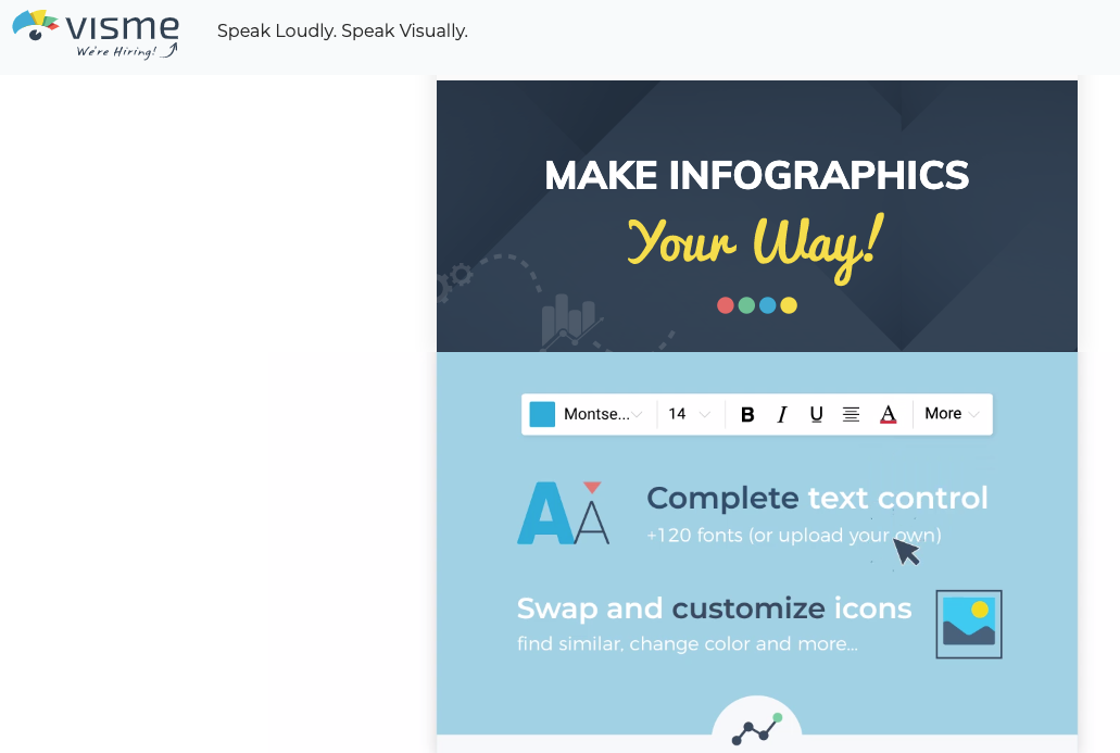
Visme’s basic account is free, but they also offer Pro and Team accounts for $25 USD or $75 USD/month, which give you access to unlimited projects, 10GB storage, the ability to download projects as HTML5 and more.
Visually
The unique thing about Visually is that it is a community tool, or “the world’s marketplace for visual content”. How, you ask? Visually’s community website offers the ability to match up those looking for paid-infographics with those selling infographics. If you are really looking to leave the design work to a professional, you can start a project, and the team at Visually will set you up with those in the community looking for work. Win-win!
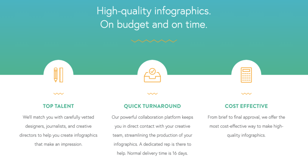
If creating your own infographics isn’t your thing, you can submit a request through Visually and access a community of thousands of designers to professionally create one for you. It all comes down to your marketing budget, and if you’re willing to do the work yourself or not.
Now, It’s Your Turn!
Infographics offer a unique, fun and memorable way to visualize your data. And, you don’t even have to be a graphic designer! There are a number of free and low-cost online tools available to help even the most inexperienced designer come up with something that is beautiful, intuitive and looks professionally made.
Reviewing your budget and time constraints will help you decide which tool will work best for the data you want to display. With some patience and a bit of creativity, you’ll have interactive and fun infographics for your audience to enjoy.
Photo Credit: Med Badr Chemmaoui on Unsplash


