What is Responsive Web Design anyway?
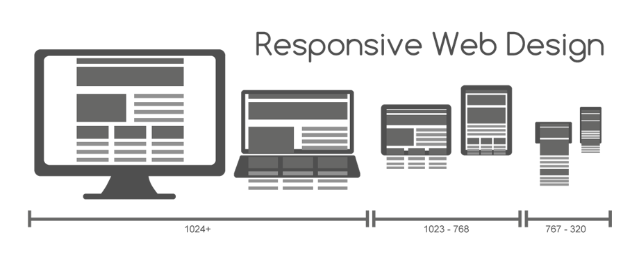
It is defined as the ability of websites to adapt to different screen resolutions in order to provide the best experience for users. For example, a site visitor will have a different experience on their desktop computer, laptop, tablet, or mobile phone, to name a few. Responsive design will lay a technical foundation for your site that will allow for the introduction of new browsers and devices over time, instead of having to recode for each one.
Check out responsive web design in action by going to umamimarketing.com in your browser of choice and dragging the corner of the browser window either larger or smaller. You’ll see the website reorganizing itself for best fit within each width as you go.
Here are some key considerations to keep in mind when it comes to Responsive Design:
1. Breakpoints
Breakpoints allow the layout of a page to change at pre-defined points, instead of staying the same, and adjusting to fit within whatever device you’re using to browse at any given time. For example, there may be 3 columns on a desktop or laptop, while only 1 column is displayed on mobile.
The work to define this is done in the CSS and will depend on the types of content within a page. While breakpoints can be set at any size, they are usually done at the common device sizes, for desktops/laptops, tablet landscape, and mobile landscape and portrait, at minimum.
2. Fluidity
Fluid scaling is used to achieve responsiveness between breakpoints, to maximize your real estate, as well as to maintain the flow of columns in a responsive grid. This can be done at the block or grid layout level, to create the best experience when sizing down browsers, or moving down to mobile, where 3 columns of content may then get stacked on top of one another.
Fluid images create flexibility and is also a key part of responsive design so that they don’t break or resize incorrectly on different screen resolutions.

3. Design for Multiple Sizes
One thing that you start to consider with responsiveness is whether to design for desktop or mobile first. If going from desktop to mobile (or large to small), you’ll start to pull out content that may not be as needed from your site.
However, it may be better to design for the opposite (small to large screens), as this may be helpful to understand limitations and inform decisions when going from one size to another and cut out anything extra that isn’t necessary from the beginning.
4. Media Queries
Different views must be enabled in different contexts via media queries. Media Queries is a CSS3 module allowing content rendering to adapt to conditions such as screen resolution (e.g. mobile phone screen vs. desktop or laptop screen). It became a W3C recommended standard in June 2012, and is a cornerstone technology of Responsive Web Design.
Put more simply, this set of rules allows developers to create designs that are fluid and adapt without losing quality or getting distorted on various devices. They help to take into account multiple display possibilities and the organized style rules can be modified quickly and easily.
5. Optimizing User Experience (UX/UI)
When designing and developing for responsiveness, ensure that you’re retaining the structure and order of elements from desktop down to mobile. This allows for fluid scaling while also reducing unnecessary load of duplicate elements that are hidden or shown at specific breakpoints.
As a result, your site visitors will be able to experience your website in an optimal way, whether they’re sitting at their desk, at a tablet on their couch, or lying in bed with their smartphone.
Summary
To summarize, you need to understand the following about responsive design:
- Breakpoints
- Fluidity
- Design for Multiple Sizes
- Media Queries
- Optimizing User Experience (UX/UI)
Now that you understand more about Responsive Web Design, please check out our recent blog posts covering more useful Inbound Marketing tips.
If you liked this video, subscribe to the Umami Marketing YouTube Channel and the monthly Digital Marketing Postcard. I’ll be back again in October to answer more of your questions. See you next month!

![What You Need to Understand About Responsive Web Design [Video]](https://umamimarketing.com/wp-content/uploads/2017/10/What-to-Understand-About-Responsive-Web-Design-Umami-Marketing-720x341.jpg)
