Here are a few examples of some awesome brand emails that were sent out over the last year; please use them to help you understand what makes a great email, and to help you plan for your future campaigns.
1. Tory Burch: “Private Sale”
Do you see what differentiates the email below from the rest of the pack? You got it – animation. And their “private sale” wording also makes the email recipient immediately feel more exclusive and valued, which may help to encourage them to seize the opportunity! It’s a great way to increase your clickthrough rates and get more activity on your landing page.

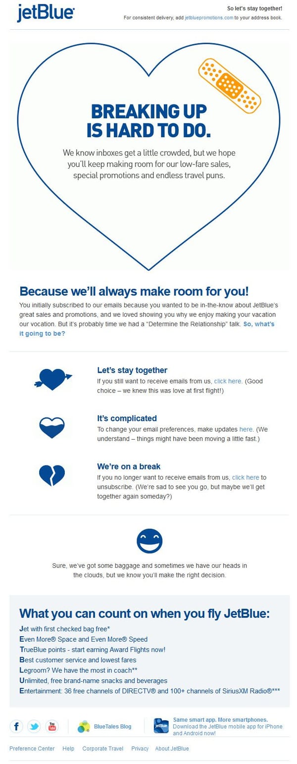
2. JetBlue: Breaking Up
Nurturing and continually delighting your audience is the best way to make them feel important and valued by your business. This cute email from JetBlue is a super creative way to touchbase with your inactive client list, or clients you haven’t heard from for a certain period of time. The wording in their email reminds you of your “relationship” with JetBlue, and makes it easy for you to take action on the next stage of this relationship – keep receiving their emails, update your email preferences, or remove yourself from their mailing list completely – all in the same playful tone of voice.
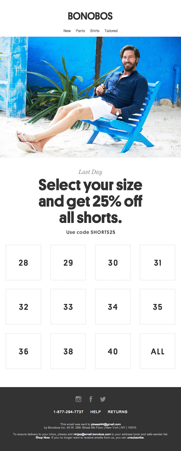
3. Bonobos: Shorts Sale
This email from Bonobos is a great example for a retail clothing business. This interactive layout shows how easy it can be to offer an enticing way (a 25% off discount) to increase clickthrough rates (by clicking on your waist size) without having to shop through the entire website. It’s a very creative way to get those users who may not like online shopping to click a button or two and find exactly what they need right away, increasing your overall conversion rate as sales are made.
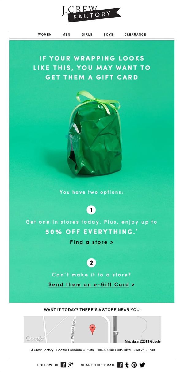
4. J.Crew: Gift Cards
With this email, J.Crew has found a way to advertise gift card sales over the holiday season. At the same time, they’ve also added a smart call to action to take advantage of their 50% off in-store sale, which is a great opportunity to increase clickthrough rates to their website. See what they’ve done at the bottom of the email as well? They’ve used geo-targeting to showcase a map of the location of the nearest store to entice buyers to visit their stores if they want to get shopping right away.
There are literally hundreds of other examples of amazing email marketing campaigns that kicked some serious butt in the past year, but we’d like to hear about more of them from you. Please share some of your favourite campaigns from 2015 in the comments below, and we’d love to check them out.
For more information on why email marketing is an important tool to focus on for your inbound marketing campaign in the upcoming year, please download our copy of HubSpot’s State of Inbound report:
