Post-Mobilegeddon: Maximize Your Mobile Marketing Strategy
Unless you were hiding under a digital marketing rock for the past few months, you’ll know that Google’s “Mobilegeddon” algorithm update launched April 21. As of this date, a website’s mobile-friendliness will now serve as a ranking signal throughout mobile search results, and websites not yet optimized for mobile are now significantly affected, with some no longer even showing in mobile search results.
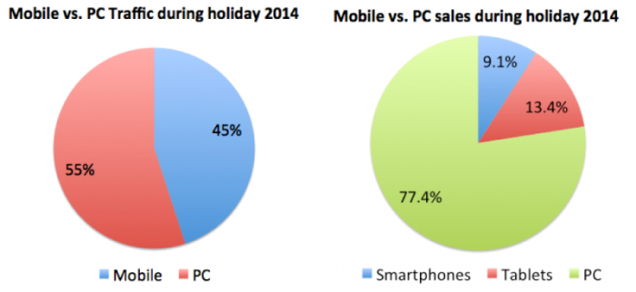
So why the need for such a big update? Well, it’s become obvious to business owners that mobile is the new leader of marketing, with some record high stats achieved over the 2014 shopping season, as reported by IBM:
- Online sales were up 13.9 percent over the same period in 2013
- Mobile traffic accounted for 45 percent of all online traffic for the 2014 holiday season, an increase of 25.5 percent YoY
- Mobile sales accounted for 22.6 percent of all online sales for the 2014 holiday season, an increase of 27.2 percent YoY
Online giants Target.com and Amazon.com also reported that mobile traffic for both sites increased by 60% during the holidays, and doubled their Black Friday mobile sales. These stats alone tell us that mobile is central to consumer shopping, but it doesn’t stop there:
- 91 percent of smartphone users have their device with arms reach 24/7 – Econsultancy
- Mobile devices account for 50 percent of YouTube’s views – YouTube
- Mobile payment volume in the US is forecasted to reach $818 billion by 2019 – Yahoo
- Three quarters of digital ad spend is forecasted to be mobile by 2019 – eMarketer
- Mobile email conversion rates have jumped by 70 percent between Q4-2013 and Q4-2014 – YesMail
- Mobile Best Practices Can Boost Campaign Performance Up To – Mobile Marketing Association
Do you need more proof?! Mobile marketing is the way of the future; if you haven’t invested enough time in your mobile marketing strategy, you need to start now.
Be Compatible & Consistent
Consumers access the internet in a variety of ways, and your website needs to be optimized and compatible with all devices. With more and more people opting to use their smartphone to browse sites and online stores, the mobile experience also needs to be of high quality and stability. Don’t make your users zoom in and zoom out to bring your content into focus. Test your portrait and landscape views. Make sure your pages load well under 4 – 5 seconds.
Your customers will also expect your branding across all devices, so make sure their experience is consistent, whether they are accessing your site from a PC, tablet or smartphone.
Localized Marketing
About 40 percent of mobile search has local intent. Localized marketing provides your customers with information and results that are personalized, targeted and relevant, so make sure your mobile website is submitted to Google My Business. You should also be connected to other location-based sites like Yelp or Foursquare.
Reaching your on-the-go consumers with strategies such as geo-targeting will also help customers looking for local information, and can help you target them as well: for example, mobile coupons when a consumer arrives at your store.
Content Marketing
Content marketing specifically targeted to mobile users is becoming increasingly important. As noted above, mobile devices now account for 50 percent of YouTube’s video views, showing us that video is a preferred choice for mobile users. Facebook, Instagram and Twitter have all taken note, which is why they were all quick to jump on the video advertising bandwagon. Review your content marketing strategy and make sure it includes a plan for your mobile users. It’s also important to remember to keep written content brief. A mobile screen is clearly a lot smaller than that on a PC or tablet, so make sure your landing pages are concise and to the point to avoid looking cluttered.
Clickable CTA
This one may sound obvious, but you’d be surprised how many businesses fail at this simple update. Make sure your Call to Action button is large enough for your users to easily tap it with their thumb; the general rule is that your CTA should be 44×44 pixels, large enough for a thumbprint and with enough space around it to avoid accidental clicks on other buttons or links.
Mobile-Friendly Emails
If you’re going to be email marketing your newly minted mobile-friendly website, you need to make sure your email content is mobile-friendly as well. Make sure your images are resized appropriately, your font doesn’t require your users to zoom in and out to focus, and your CTA button or link is sized properly, as noted above.
Hopefully these tips will help you maximize your current mobile marketing strategy to its highest potential and increase your mobile traffic rates. If you’d like more information on improving or even implementing your mobile marketing strategy, please give us a call today.
**Did you update your site for the April 21 deadline? If you’re unsure, use Google’s Mobile-Friendly Test to test your design**


