With Google owing almost 65% of the online search share, they are taking this mobile statistic very seriously. So seriously, in fact, that they are starting to roll out mobile-first indexing, which means search results will soon prioritize mobile content vs. desktop when it comes to rankings…even for users still using a desktop to search.
Regardless if your website is optimized for mobile already or not, Google’s mobile-first index may affect you. Read on to find out how you can stay ahead of the change.

If you do not have a mobile website:
Do not panic. Although you really should have a mobile site at this point (re-read the above-mentioned stat on how mobile-search is taking over the world, please!) Google will still be able to crawl your desktop website the same as it always has, despite the fact that they’ll be using a mobile user agent to view your site.
If you’re in the process of building your mobile site, keep in mind that a functional desktop-oriented site can be better than a broken or incomplete mobile version of it. And if your desktop site is already ranking well, you need to make sure that all content and links within the mobile version are similar so that the new crawl process can rank it just as well.
If you do already have a mobile website:
If you already have a live mobile site, it’s very important to ensure that it contains a similar amount of content as your desktop site. If a page on your mobile site has less content than the same page on your desktop site, Google will now only see the mobile version with less content, which may give it a lower ranking:
Our ranking systems still typically look at the desktop version of a page’s content to evaluate its relevance to the user. This can cause issues when the mobile page has less content than the desktop page because our algorithms are not evaluating the actual page that is seen by a mobile searcher.
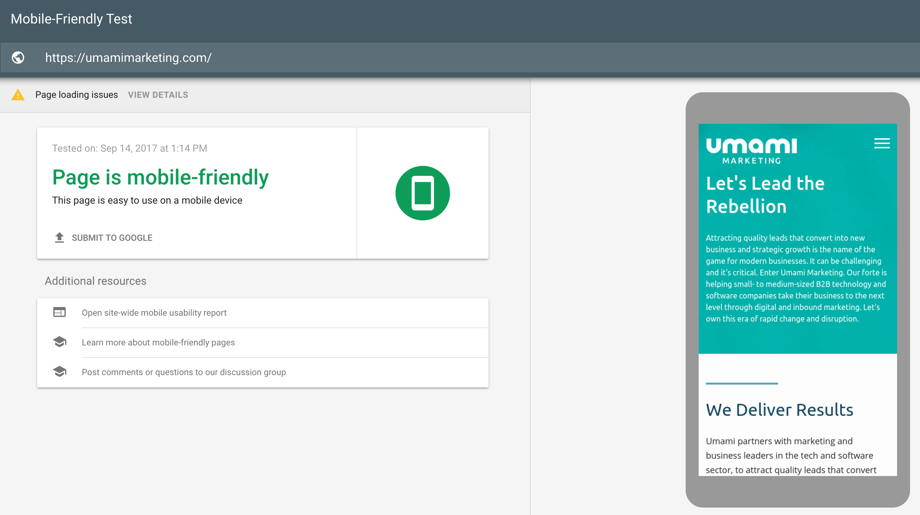
Your best option is a responsive approach, where your content is exactly the same between desktop and mobile. Run a free diagnostic to check out just how mobile-friendly your current site is.

You also still need to ensure that your responsive site or mobile site are well-designed and well- optimized. Having a mobile site alone doesn’t mean you’re set. Google will still be crawling data and ranking on the same signals as before, such as your site load speed, meta data, tags, content, keywords, and structured data. SEO still matters, and on-going improvements to your site’s SEO should still be a priority.
When is the mobile-first index rolling out?
Google is experimenting the new indexing process and will only be rolling it out to a small group to test out the results, and that group will have no idea which index they’re actually using. If that’s successful and the index is deemed useful, then they will roll it out across the board, and will likely fully replace desktop-first indexing so that mobile-first will be the only indexing process used going forward.
How will this affect your search engine rankings?
The “Mobilegeddon” algorithm rollout from almost two years ago already determined that a website’s mobile-friendliness now serves as a ranking signal throughout mobile search results, and websites not optimized for mobile are significantly affected (with some no longer even showing up in the results listing). This still remains the case with the new index: content that is not mobile-friendly will not rank as well.
However, it’s still to be determined if rankings will be additionally impacted by this new indexing process. We’ll know more as Google continues to experiment with the initial test rollout.
What can you do now to be proactive?
Google’s Webmasters blog has issued a few recommendations to site owners and administrators prepare for the mobile-focused index:
- If you have a responsive site or a dynamic serving site where the primary content and markup is equivalent across mobile and desktop, you shouldn’t have to change anything.
- If you have a site configuration where the primary content and markup is different across mobile and desktop, you should consider making some changes to your site.
- Make sure to serve structured markup for both the desktop and mobile version. Sites can verify the equivalence of their structured markup across desktop and mobile by typing the URLs of both versions into the Structured Data Testing Tool and comparing the output. When adding structured data to a mobile site, avoid adding large amounts of markup that isn’t relevant to the specific information content of each document.
- Use the robots.txt testing tool to verify that your mobile version is accessible to Googlebot.
- Sites do not have to make changes to their canonical links; we’ll continue to use these links as guides to serve the appropriate results to a user searching on desktop or mobile.
- If you are a site owner who has only verified their desktop site in Search Console, please add and verify your mobile version.
To summarize…
The sooner you can make improvements to the mobile version of your website, the better. This change hasn’t been initiated by Google just as a make-work project: it’s because mobile search is rapidly continuing to grow, and they want to provide a better experience for mobile users. And you should want to provide a better experience for your visitors as well, no matter which device they are using.
Stay tuned for our next post on a mobile optimization checklist you can put to use when building or improving your current site. In the meantime, you should also check out our free whitepaper on Growth-Driven Design, which may motivate you for a website overhaul in general:


