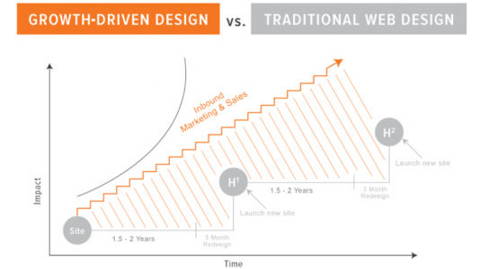
But how can you ensure your site serves its intended purpose? Once a visitor reaches your site, how can engage them and nurture them through the sales process?
There are a few common mistakes when it comes to redesigning your website. These can be solved with Growth-Driven Design, which focuses on the user and meeting their needs.
1. Only Updating Your Site Every Few Years
Everything you do should be part of a continual improvement process. If you wait several years to redesign your site, then there will be a long period of time where your site may be outdated and not working optimally for you. This issue can be solved with the Growth-Driven Design process, which means constant change based on data and analytics, in order to make ongoing improvements, increasing visitors, leads and customers.
2. Basing Your Design on Trends or What “Looks Good”
It’s easy to get caught up with current design trends, and wanting to make your site look good, without considering if that means it’ll actually serve it’s purpose to drive traffic, engage visitors, and help with sales! A website should be built based on historical data and analytics, to make gradual changes and optimizations that will bring in better results over time, and not with flashy overdone design tricks.
The key is to ensure that visitors know what steps to take next, and maximizing conversions.
Growth-Driven Design (GDD) allows you to find opportunities for improvements, with changes based on actual data.
3. Not Updating Your Content
Businesses change, and thus content should too. If you haven’t spent any time working on your content as you redesign your site and add new functionality, it’s likely that a lot of the content is outdated and will no longer be relevant either.
If you’re only paying attention to your website every few years and aren’t regularly updating your content, it’s likely that there is a lot that no longer makes sense and isn’t helping you achieve your goals. Do a review of your content and cut out or change anything that is no longer applicable or accurate, in order to achieve optimal results, and continue to do so on an ongoing basis.
4. Not Having Calls to Action (CTAs)
While a website visitor may find you, once they get there, it may not be easy for them to understand what to do or where to go next. It’s key to ensure that relevant Calls to Action (CTAs) are included throughout your site in order to guide the user to take that next step.
At the same time, you also don’t want to be confusing and include too many CTAs. Keep things simple, and base any changes on your data. Don’t overwhelm your visitors!
5. Not Optimizing Site Structure & Responsiveness
To allow for ongoing improvements, it’s key that the launchpad website is structured properly for ongoing optimization, and integrated with the appropriate toolset to do so. It should also be made responsive, so that it adapts to all device types and sizes. When you have a solid base to work with, gradual changes and improvements can be done more easily and quickly, making your business more efficient as a whole.
Summary
To summarize, common mistakes to avoid in your website redesign include:
- Only Updating Your Site Every Few Years
- Basing Your Design on Trends or What “Looks Good”
- Not Updating Your Content
- Not Having Calls to Action (CTAs)
- Not Optimizing Site Structure & Responsiveness
Now that you understand more about what common mistakes to avoid with your next website redesign, make sure to check out our recent blog posts covering more useful website tips.


![3 Copywriting Skills to 3x Results [Video]](https://umamimarketing.com/wp-content/uploads/2020/10/typewriter-720x341.jpg)